Personal Project · Mobile & Tablet UX · Figma Practice

Coffee App with Retro In-store experience - Most coffee apps reduce your order to two taps. bobabean turns it back into a ritual.

Size, then "sweet or not" — that's most in-app coffee customization. A boutique café ritual deserves better: blend, size, milk, sugar, and flavor, each its own tactile moment instead of a buried settings menu. I designed the full ordering ritual end-to-end across mobile and tablet, from splash to pickup QR code — then extended the concept with an AI-powered review management layer so the café can turn scattered star ratings into a business decision.

Personal project · Figma practice · UI exploration for a boutique vegan café concept.

Who Boutique café regulars Coffee lovers who care about "their usual," down to the syrup.
What A ritual, not a settings form Five real recipe choices, one warm, tactile screen at a time.
Why Detail is the loyalty driver And the reviews that detail earns should feed back into the business, not just decorate a listing.

Problems

What today looks like

Deep or fast — never both

Apps that let you tune every detail bury it three menus deep. Apps that are quick give you a size toggle and call it "your coffee."

Reviews that just sit there

Star ratings pile up on a listing page, but nobody behind the counter has time to read hundreds of them one by one, let alone reply.

What I designed

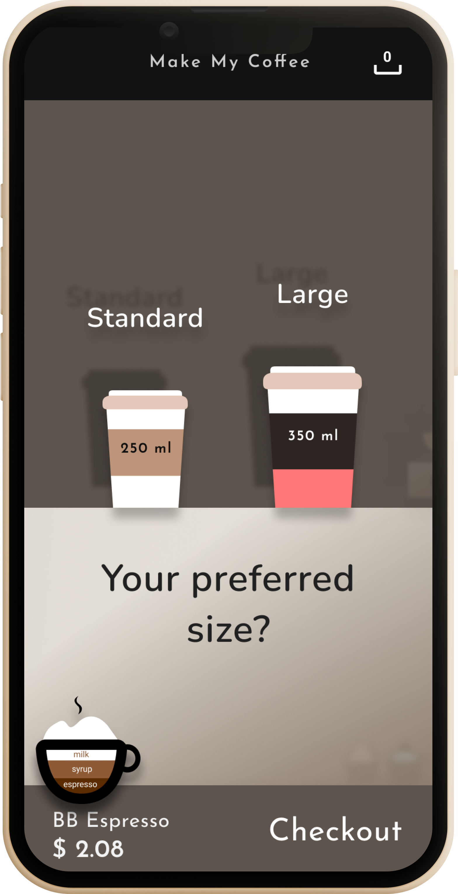
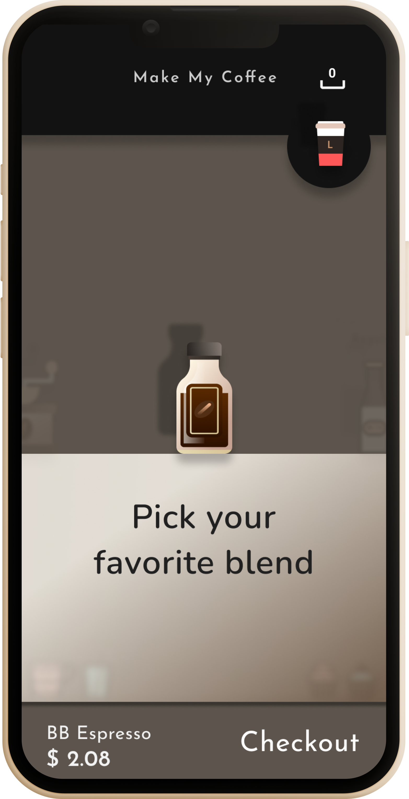
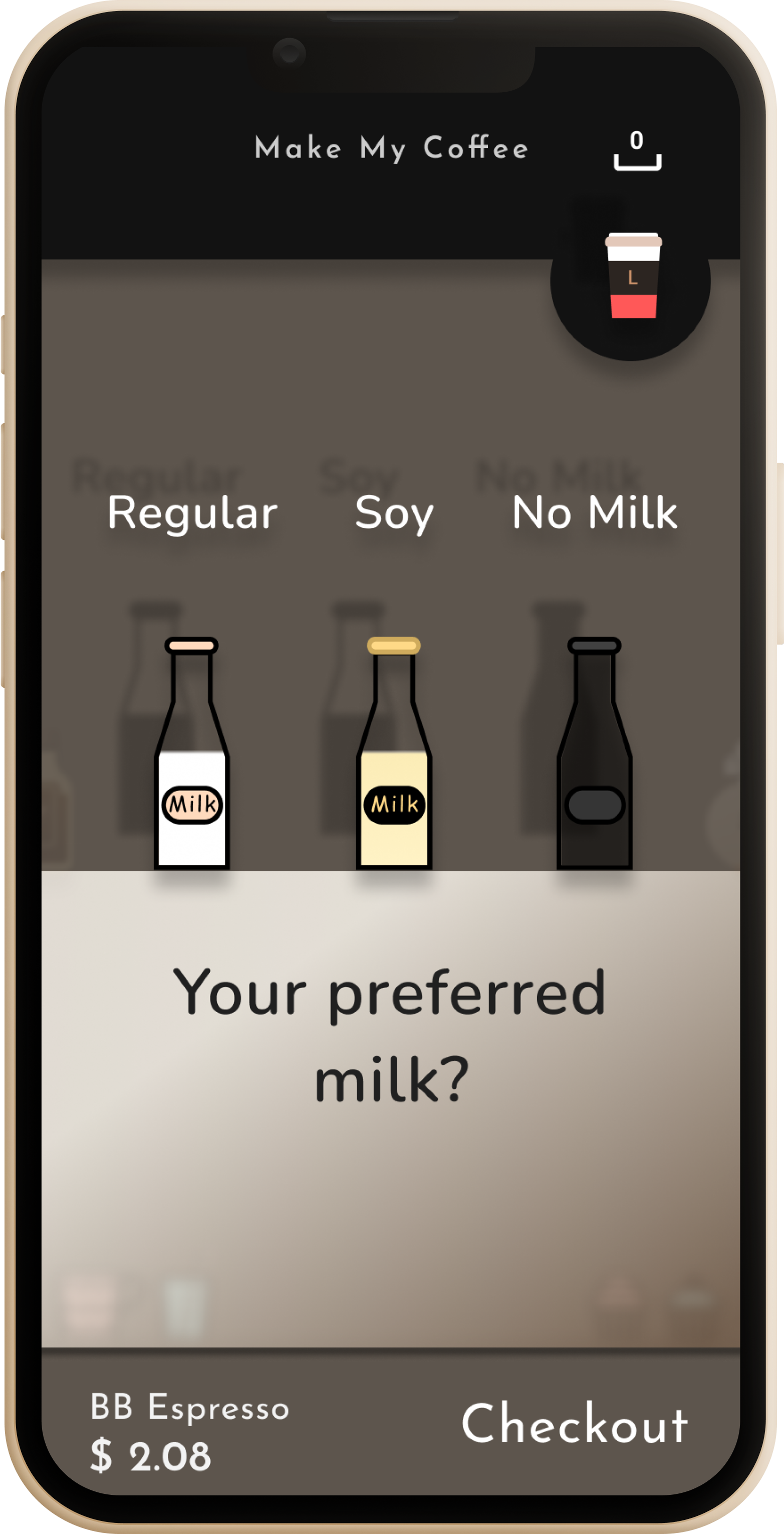
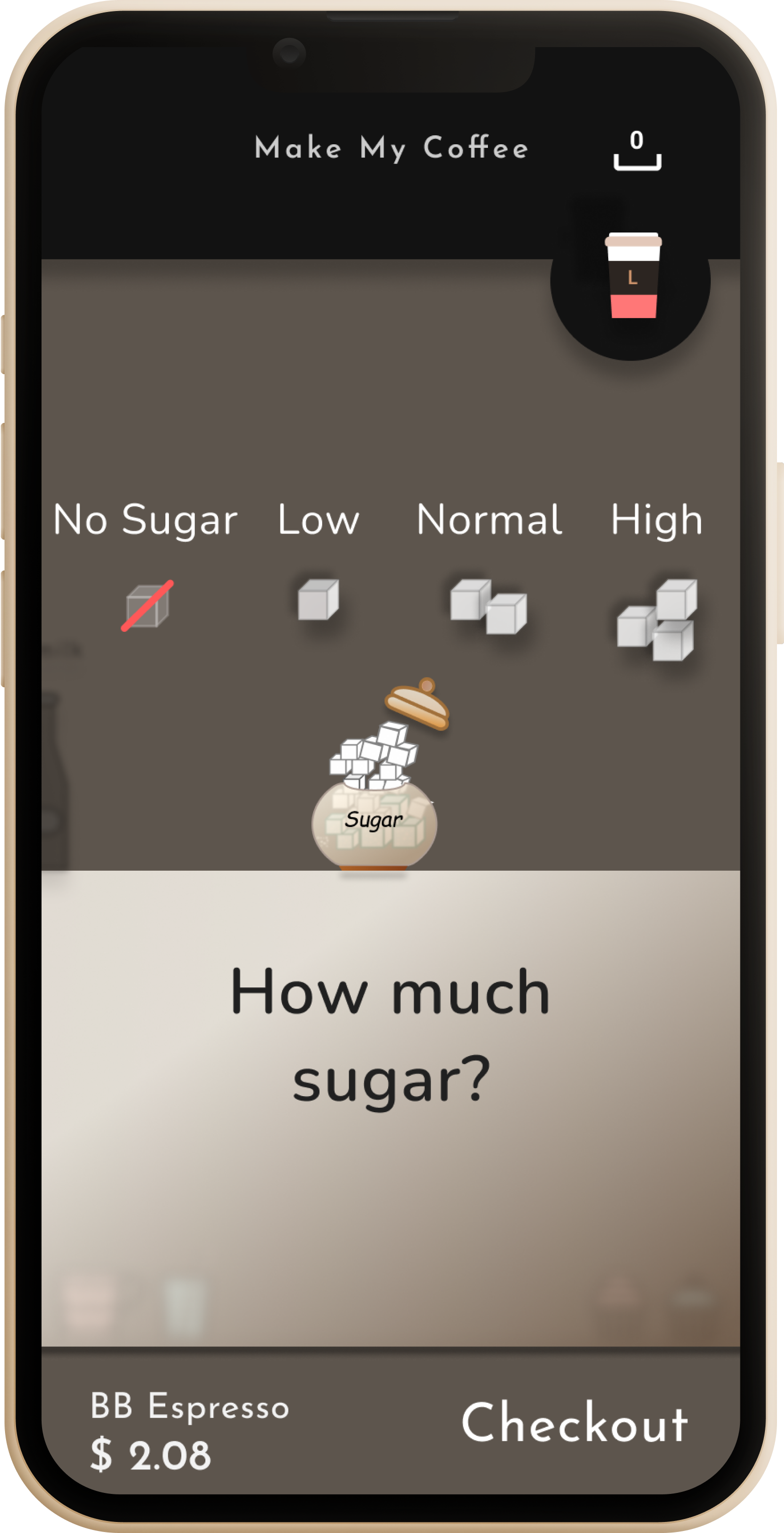
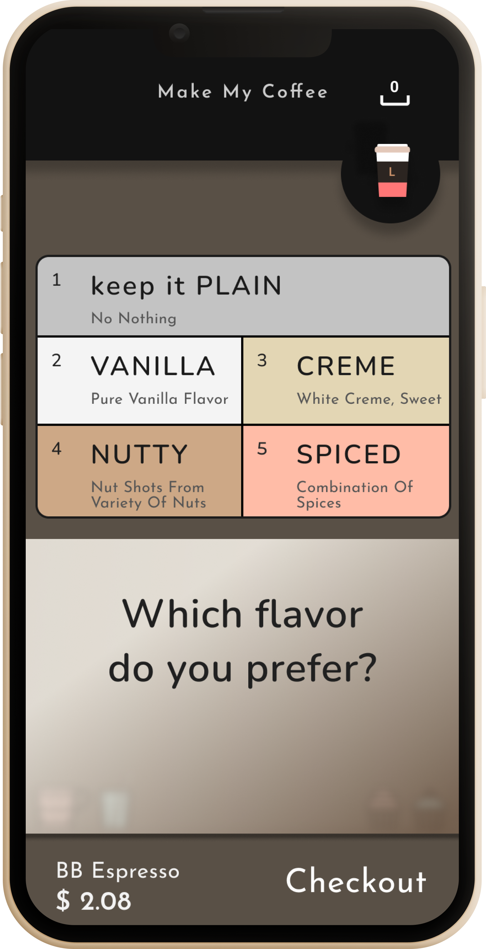
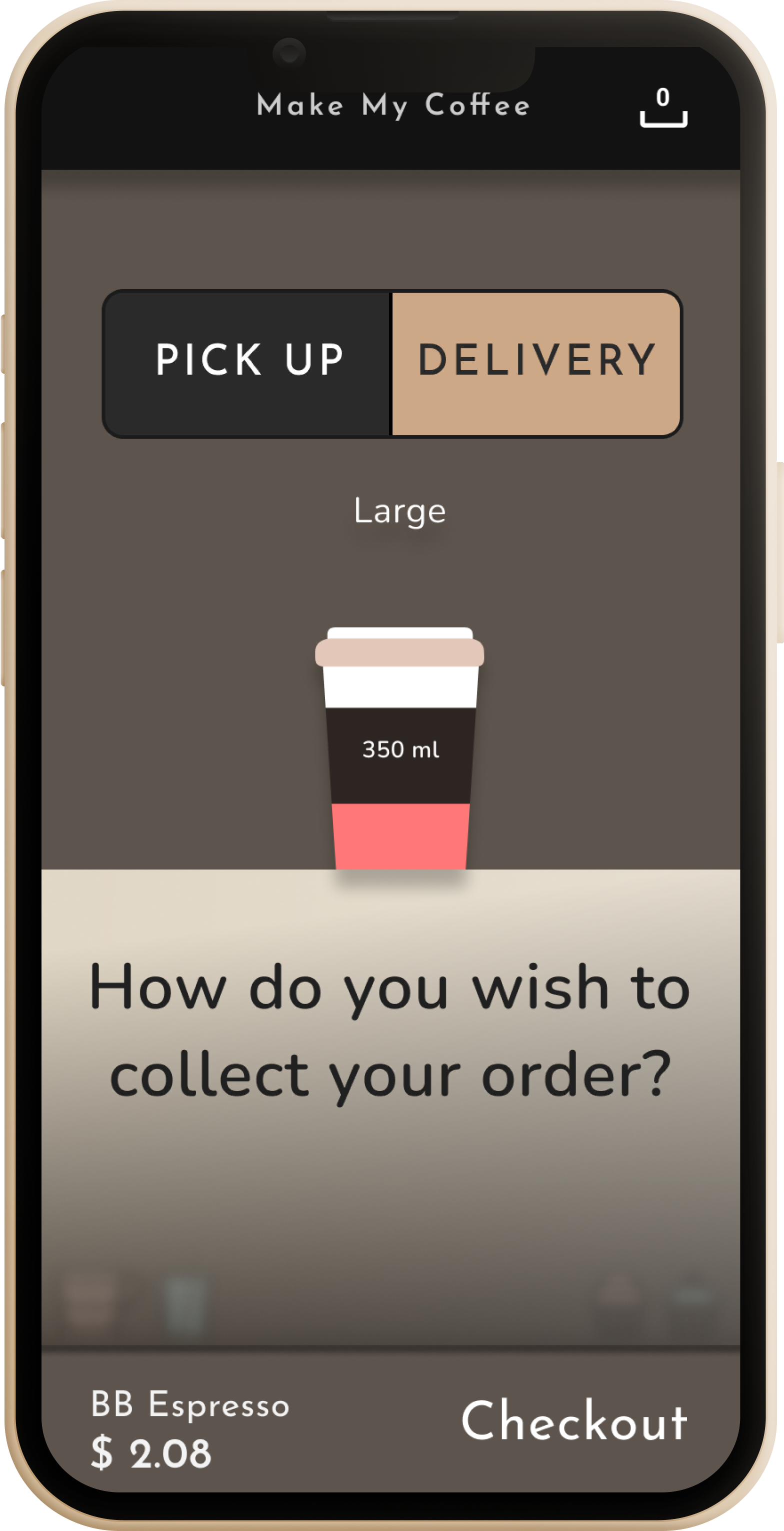
  • Five choices, five screensBlend → size → milk → sugar → flavor, each framed as one tactile question instead of a form with five fields.
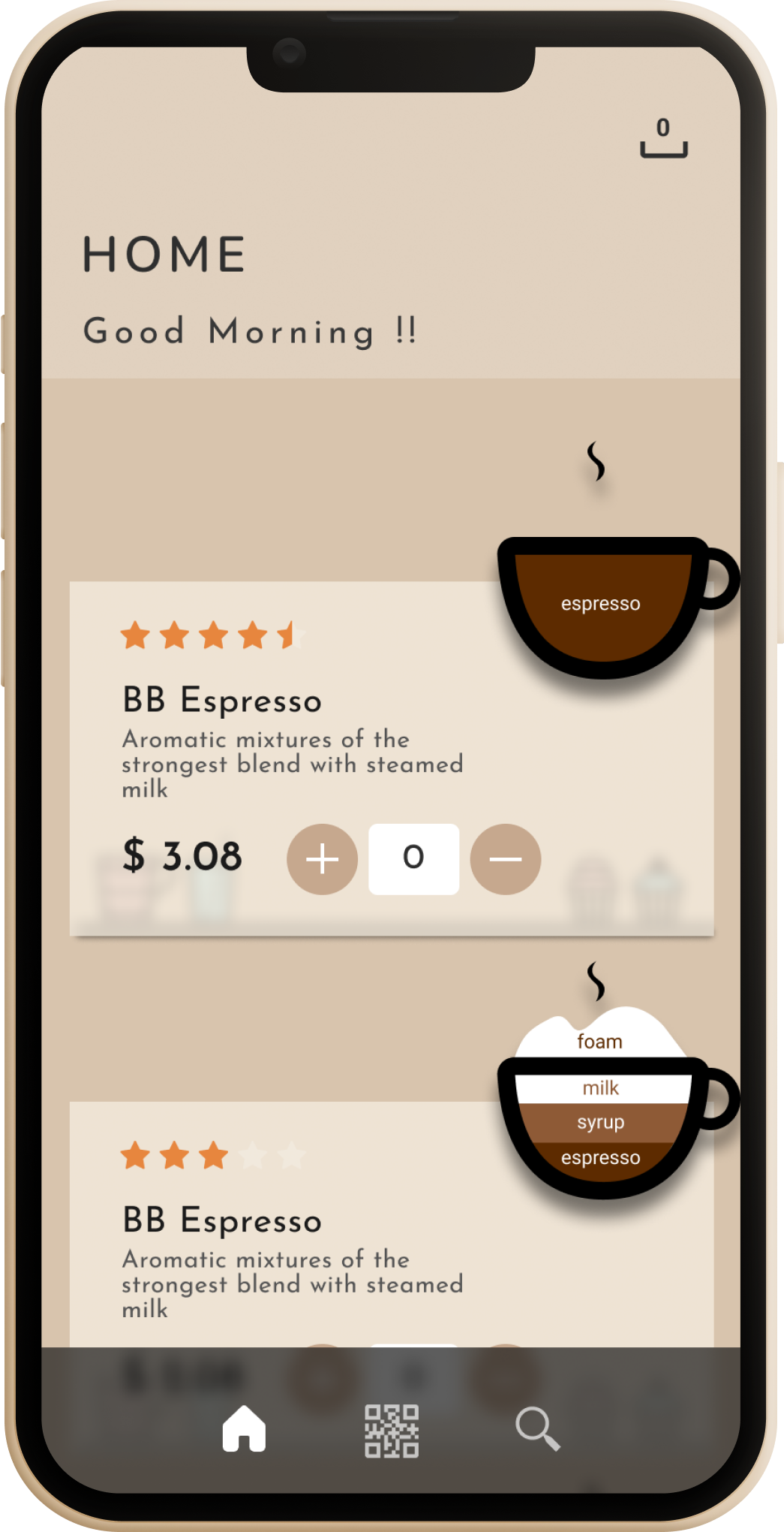
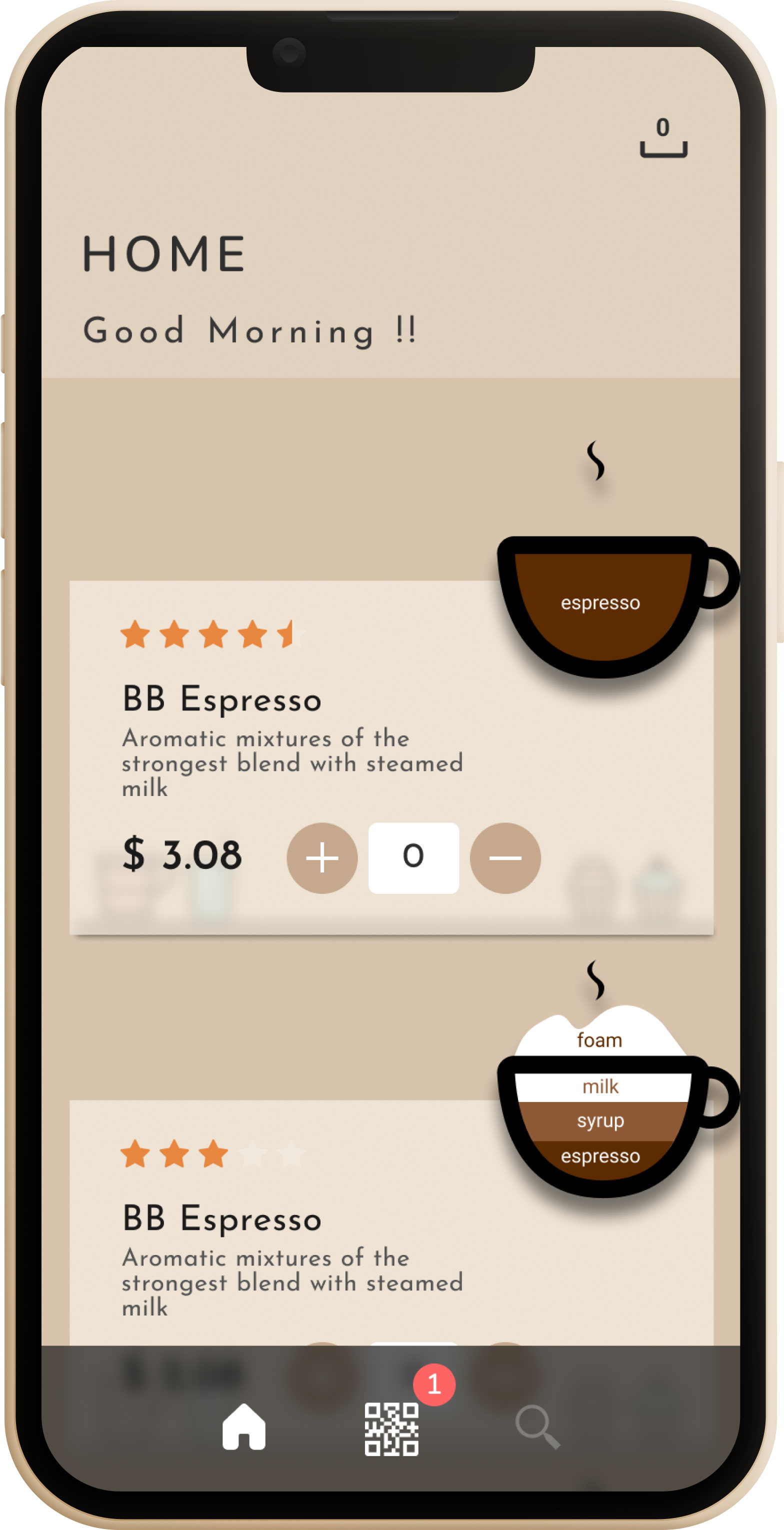
  • Ratings live on the menu, not a separate tabStar scores sit right on the home screen's coffee cards, next to the price and the "+" to order again.
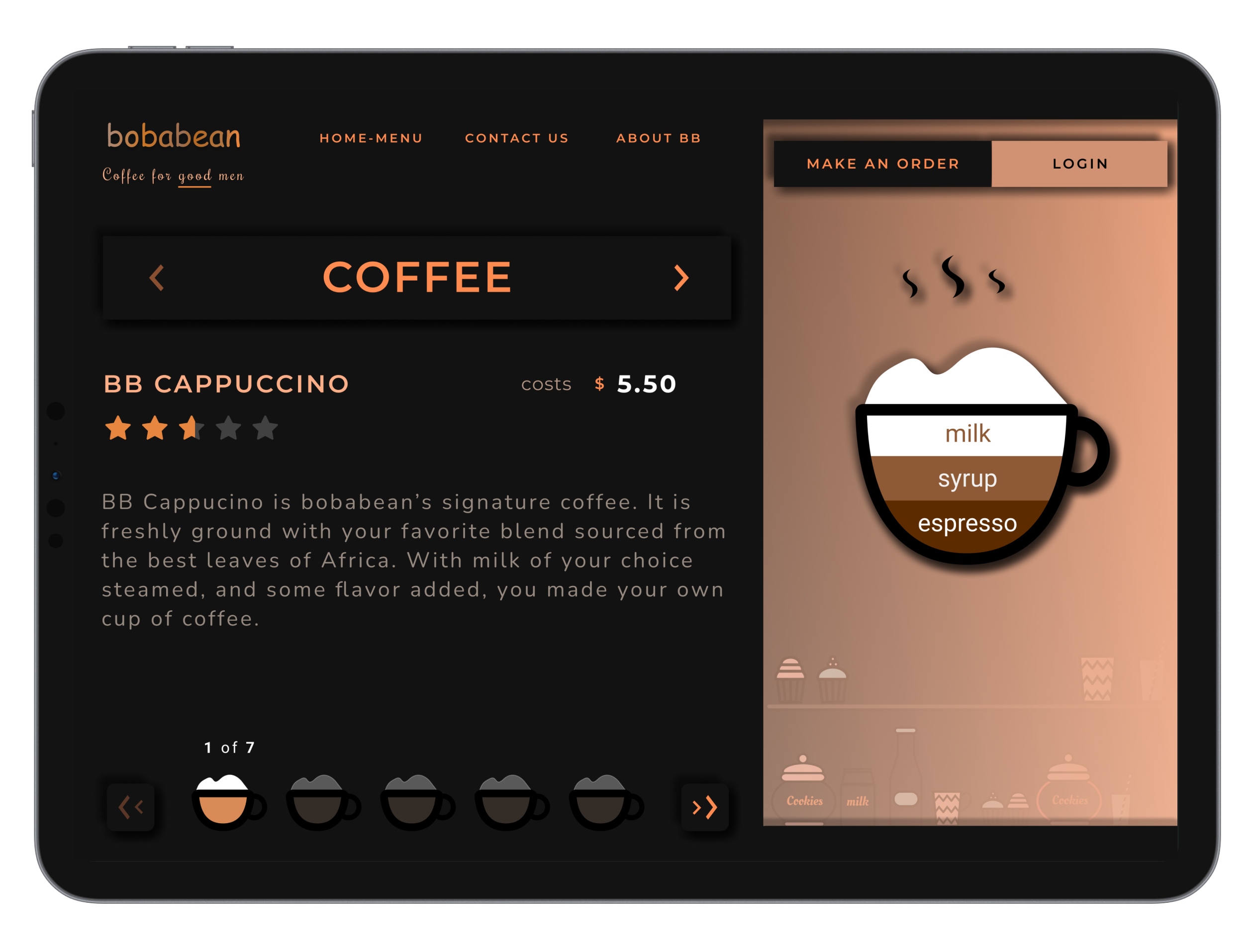
  • A tablet menu that mirrors the counterThe in-store tablet carousel ("1 of 7") reuses the same signature layered-cup icon as the phone app, so the brand feels identical wherever you order.
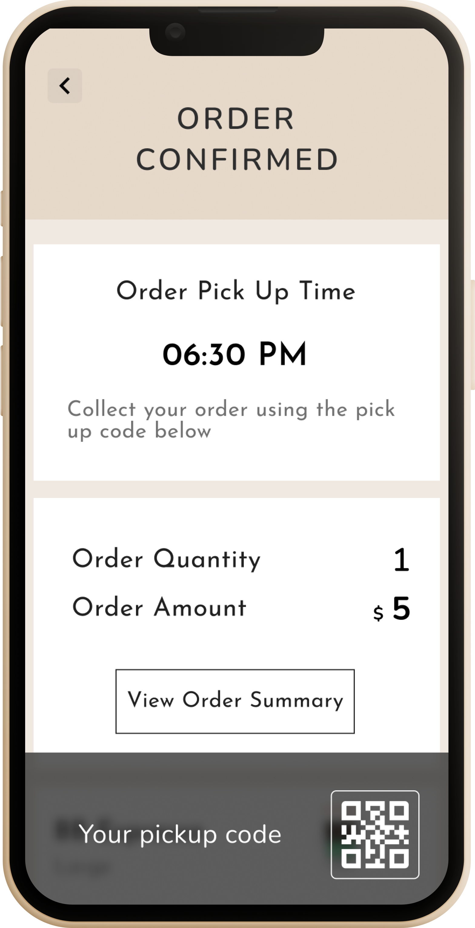
  • Pickup closes the loopOrder confirmation carries a pickup time and QR code, and a quiet badge on the home tab nudges you if an order's still waiting.
Splash screen and the rated home menu — every drink carries its star score up front. Click to view full screen.

The five-star rating was the easy part. Turning two hundred of them into next week's menu decision is the product.

What it produced

5
Recipe choices per order
blend, size, milk, sugar, flavor
2
Surfaces, one shared icon system
mobile app & in-store tablet
12
Screens, splash to pickup
home, order flow, checkout, QR pickup

Prototype

Click-through of the checkout flow — from Make My Coffee to order confirmation

Project artifacts

Extending the concept

Concept Extension · AI Product Design

An AI review management layer, so feedback becomes a business decision

bobabean's app collects a star rating on every drink card — but a rating sitting on a menu is decoration, not intelligence. I designed a review-management layer for the café owner: every review is auto-tagged by sentiment the moment it's posted, the owner can filter the whole feed by Positive / Neutral / Negative in one click, and an AI-drafted reply is suggested for each review instead of a blank text box. An insights strip surfaces which drink is winning and which complaint is repeating, so "good reviews" turns into "here's what to fix on the menu this week."

Auto sentimentEvery new review is classified the instant it's submitted — no manual tagging queue.
AI-drafted repliesOne click drafts an on-brand response tuned to the review's sentiment and the drink it mentions.
Business insightsA live strip surfaces the best-loved drink and the most-repeated complaint theme.

Runs entirely client-side for this portfolio demo — sentiment tagging and reply drafts are rule-based heuristics standing in for the production ML/LLM pipeline described above. The full write-up and the live demo are both linked at the top of this page.